Logo Design with Gemini: Ready-Made Image Prompts for Your Brand
Originally published in Turkish. Read the original →
Gemini prompts for testing a brand mark. First a text-free symbol, then one color. Don't ask for made-up letters. Draw the wordmark later in a vector tool.
A logo prompt has to be stricter than a portrait prompt. When doing logo design with Gemini, you spell out the background, the number of colors and the ban on text up front so the model doesn't print a fancy poster. Vector examples on the Midjourney side are in the logo design guide. The general form of photo prompts is in the Gemini photo prompts.
The prompts below are for testing a mark. Don't put the brand name in the prompt.
Single-color symbol
Minimal logo mark of a [single olive leaf], flat vector, one dark green shape on an off-white background, geometric, centered, generous empty space, no letters, no words, no mockup, no shadow, no 3D, no texture.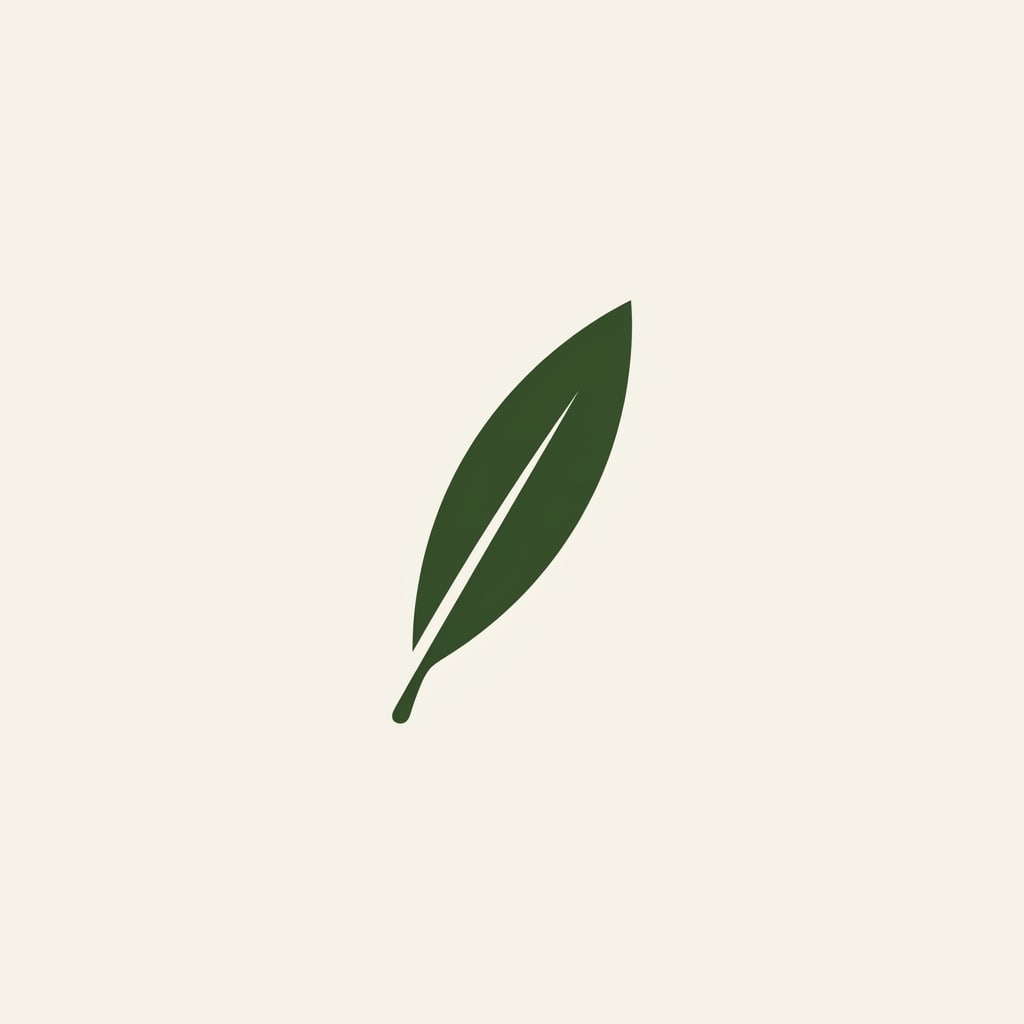
Gemini (Nano Banana 2.1) output, generated with this prompt.
Change the object: a cup, a roof, a wave, a needle. One object is enough. Two metaphors at once don't tell the brand's story; they produce a jumbled icon.
Round seal
Simple circular emblem, a [small lighthouse] reduced to a few thick shapes, black on warm white, flat design, even stroke, no text, no Latin letters, no numbers, centered, logo sheet, not a photograph.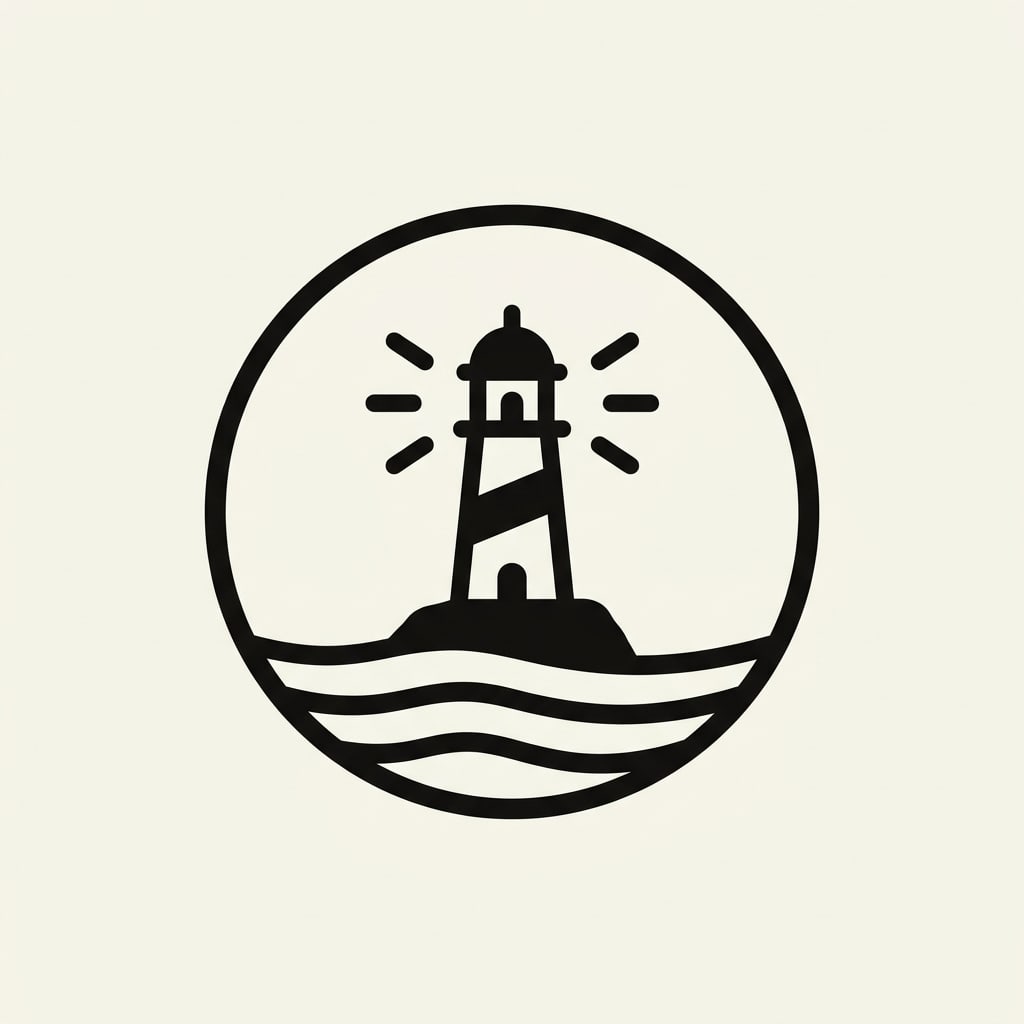
Gemini (Nano Banana 2.1) output, generated with this prompt.
Don't put the sea, a mountain and a city skyline in the same seal. A seal must be readable from a distance too. Detail disappears as it gets smaller.
Negative space
Logo mark using negative space, a [bird] suggested by two overlapping shapes, black and white only, flat vector, centered on a light grey field, no text, no gradients, no photorealism, large clear margins.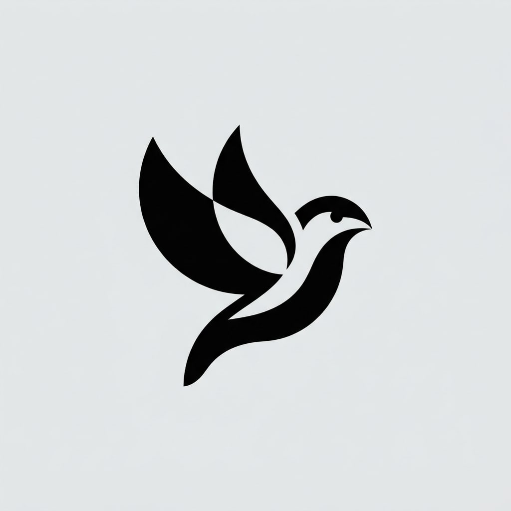
Gemini (Nano Banana 2.1) output, generated with this prompt.
Don't write photorealistic in the negative space prompt. That word turns the mark into a photograph. The goal here is a simple form that will hold up in print.
Application mockup
If you like the mark, use a second prompt to look only at placement. This frame is not the final file.
Place the same simple black logo mark on a plain kraft paper card, top center, lots of empty space below, no brand name, no fake letters, soft daylight photo of the card, realistic paper texture.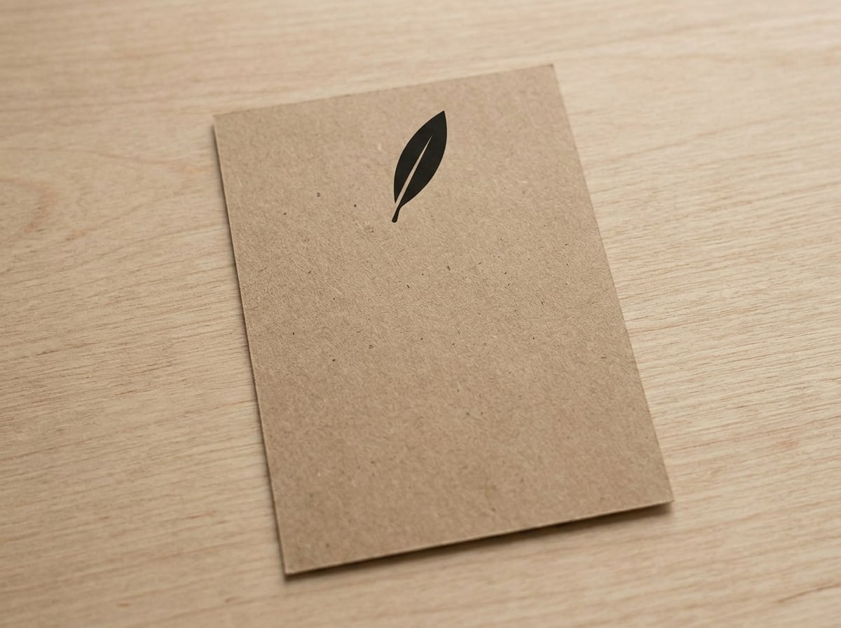
Gemini (Nano Banana 2.1) output. The olive leaf mark was given as input.
If letters appear on the card, repeat the prompt with no readable text. Don't try to force the brand name onto this frame.
Next step
Save the mark you like as a screenshot and redraw it in a vector tool. The edges of an AI frame break up in print. If there are two colors, printing gets easier too. A third color and gradients delay the decision at the testing stage.
Don't put competitors' logos in the prompt. Copying a known brand with in the style of is neither unique nor free of trademark problems. Pick the object from your own business.
Color test
Keep the first round black and white. Once the form settles, add a single ink color in a second prompt. Two colors only make sense if one is the background and the other is the mark. Don't add a third color on the same day. The decision drifts toward how pretty the color is, and the form stays weak.
Same simple logo mark, flat vector, ink color #1F4D3A on warm off-white #F4F1EA, no extra colors, no gradient, no shadow, no text, centered, large margins.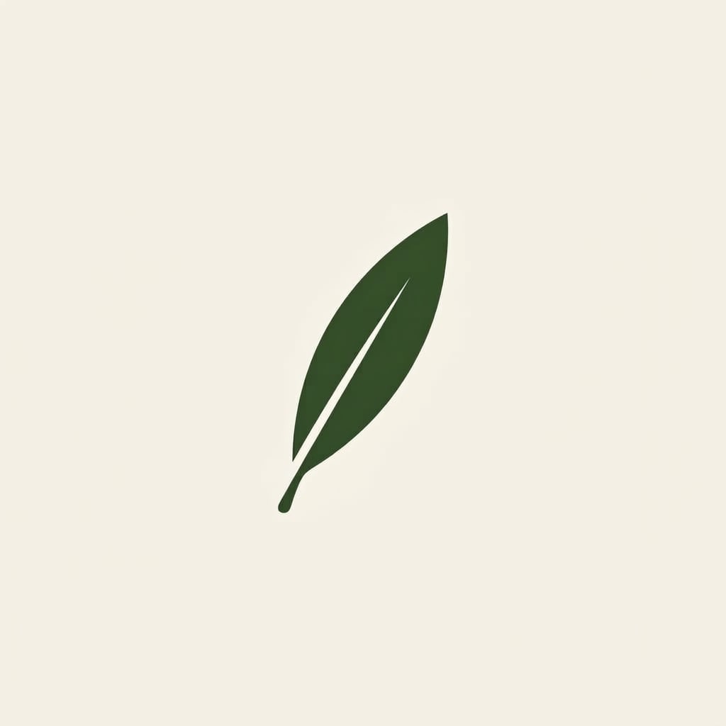
Gemini (Nano Banana 2.1) output. The olive leaf mark was given as input.
Replace the color code with your own palette. If you don't have a brand guide, pick one of dark green, navy or brown. Don't put pure red and pure black side by side on day one. Together they read like a warning sign.
Legibility at small sizes
Shrink the mark down to the size of an app icon on a phone screen. If the leaf vein, the window panes and thin lines disappear, the form has too much detail. Add thick shapes, readable at small size, no thin lines to the prompt. If thickening the thin line isn't enough, simplify the object. Ask only for the lighthouse tower, not its stairs.
Look at it on paper too. An edge that looks sharp on screen wobbles in print. That's why the test frame is not the final file. Rebuild the same thickness in vector.
When the name comes in
If the mark has become recognizable within three tries, write the brand name separately underneath in a plain typeface. Don't have Gemini do this. Letter spacing and Turkish characters are not the image model's job. If İ, ş and ğ get mangled, the whole word looks amateurish. Keep the mark in one file and the text in another. Layer the two in your design tool.
Four tries per page is enough. Instead of regenerating a form you don't like ten times, change the object. A weak metaphor is not fixed by a longer prompt.