Image to Code with Kimi K2.5: Generating Front-end from UI Mockups
Originally published in Turkish. Read the original →
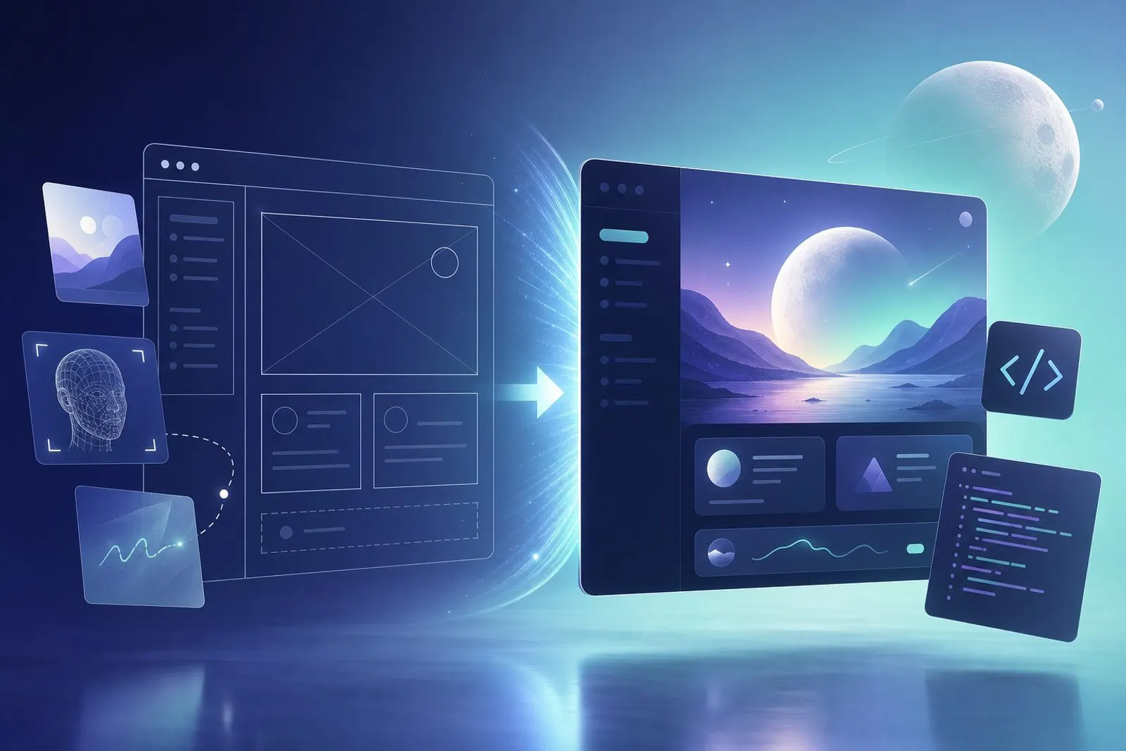
Practices for generating HTML/CSS/React components from screenshots or Figma-style mockups with Kimi K2.5, plus limits and quality-control tips.
The gap between design and development is still the main source of wasted time on most teams. Kimi K2.5's multimodal capabilities offer a practical way to close that gap: hand the model a mockup or screenshot and get a front-end skeleton out directly.
How Realistic Is Image to Code?
Expecting "pixel-perfect output" usually leads to disappointment. K2.5's strength is that it correctly reads layout hierarchy, spacing, typography groups and repeating card/list patterns. In most scenarios, the color palette, grid and component boundaries turn into a usable skeleton.
The weak spot usually shows up in the details: custom fonts, subtle animations, brand tokens and accessibility labels. Rather than expecting these in the first pass, it is healthier to request them deliberately in a second round.
An Effective Workflow
For more consistent results, try this order:
1. One screen, one goal. Instead of the entire dashboard, first send a slice such as the header + filter row. 2. Pin down the stack. Give clear constraints like "React + Tailwind, split components into separate files". 3. Add design rules. Have the spacing scale, breakpoints and dark/light preference written as short bullet points. 4. Ask for code + explanation. Have the model summarize which area maps to which component; review gets faster.
An example prompt tone could be: "Convert this mockup into React components with mobile-first Tailwind. Make the cards reusable. Don't use inline styles."
Quality Control Checklist
Before merging the generated code, a quick checklist helps:
- Does the responsive behavior break at real device widths?
- Is semantic HTML (
nav,main,button) used? - Are contrast and focus rings sufficient for accessibility?
- Are spacing tokens preferred over hard-coded pixel values?
- Have
alttext and load sizes been considered for images?
These items bring the vision model's "looks nice but fragile" output closer to production quality.
When to Use It and When Not To
K2.5 image to code saves time especially in these cases:
- Spinning up a quick POC from a prototype
- Generating skeleton components after a design review
- Moving an old UI screenshot to a modern stack
For products tightly bound to a corporate design system, however, it is better to treat the model as a "first-draft generator" rather than an "automatic production engine". Tokens, variant APIs and the Storybook structure should be completed by people or existing generator tools.
Generation That Plays Well with the Design System
The biggest risk of code generated from an image is that it ignores the existing design system. To reduce this, add a short glossary to the prompt: primary button name, spacing scale, color tokens, typography classes. Instead of building "a new world", the model gets closer to speaking your language.
In the second round, ask only for the deviations: "Rewrite this output to use our Button and Stack components." That way the vision model's layout reading is preserved, while the implementation layer fits the team's contract.
Clarifying the Handoff
To make K2.5 a shared language between design and development, fix the delivery format. For example, for each screen: (1) the image, (2) acceptance criteria, (3) the list of generated components, (4) known gaps. This format reduces the "AI generated it, it got merged" rush and speeds up review. The same slicing works in sprint planning too: critical flow screens first, then secondary states. That way vision sessions are tied to prioritized backlog items instead of scattered experiments.
Conclusion
Generating front-end from mockups with Kimi K2.5 is a concrete use case that shortens the design-development loop. Success comes not from expecting a perfect UI in one shot, but from slicing the screen, clarifying stack constraints and making accessibility/responsive checks mandatory. When visual understanding and code generation come together, the frontend team spends less time on skeleton work and more on product decisions.