The 13 Best Tailwind CSS Component Libraries: A Guide to Modern Web Development
Originally published in Turkish. Read the original →

We compared the 13 best Tailwind CSS component libraries that speed up interface development in modern web projects, covering their architectural approaches and use cases.
In modern web interface development, Tailwind CSS is indisputably the industry's most popular CSS framework thanks to its utility-first approach. The innovations in Tailwind CSS v4 in particular — modern configuration based on the @theme directive, the astronomical speed boost delivered by the new Rust-based Oxide build engine, and the end of the need for JavaScript configuration files — have taken the developer experience to a whole new level. Still, designing form controls, dynamic dialogs, tabbed menus or data tables from scratch in a web project carries a serious cost in time and maintenance.
This is exactly where Tailwind CSS component libraries come in: by providing pre-tested, accessibility (a11y) compliant and easily customizable interface elements, they speed up the product development cycle enormously. What's more, with the Tailwind Labs team joining Shopify and the commercial Tailwind Plus service (formerly Tailwind UI) closing to new sales, independent open source community libraries have become more strategically important than ever. In this comprehensive guide, we take a detailed look at the 13 best Tailwind CSS component libraries that serve different needs and architectural approaches.
Architectural Criteria When Choosing a Component Library
Before adding a UI library to your project, you need to evaluate how the chosen library will integrate into your codebase and how it will affect long-term maintenance. In the modern ecosystem, four main distribution models stand out:
- Copy-Paste and CLI Registry Tools: In this approach, pioneered by the shadcn/ui school, the component's source code is added directly into your project. With no
node_modulesdependency, full ownership of the code stays with your team. You can freely edit the code blocks to fit your project's design language. - NPM Package Distribution: Libraries like HeroUI or Flowbite are installed as traditional npm packages. Updates are managed centrally through package versions; however, deep customization of components is limited to the API and theme variables the library allows.
- Pure CSS and Plugin Approach: Solutions like daisyUI and FlyonUI define semantic component classes (
btn,badge,card) instead of piling dozens of utility classes into your HTML. They add no JavaScript runtime overhead, don't bloat build times and work with any framework. - Unstyled (Headless) Accessibility Primitives: Tools like Headless UI contain no visual styles at all. They only solve keyboard interaction, focus trapping, ARIA labels and state management, leaving the visual design entirely to your own Tailwind classes.
The 13 Best Tailwind CSS Component Libraries
1. Preline UI
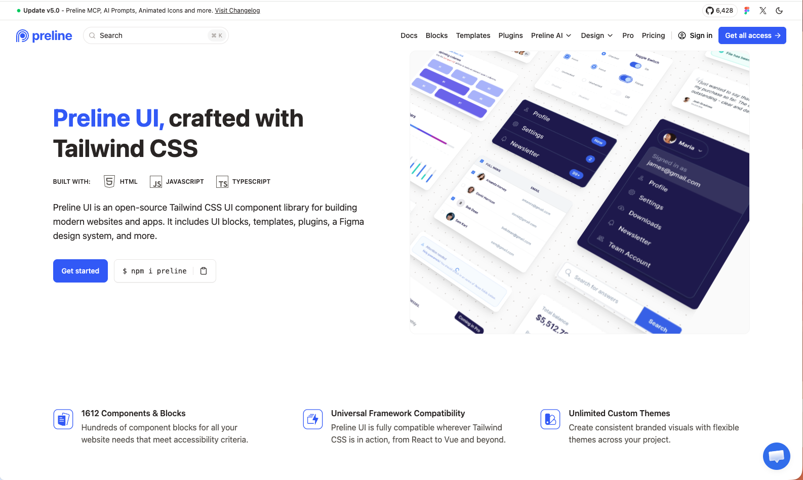
Preline UI is a huge ecosystem that brings rich HTML/JavaScript components, modular page blocks and ready-made templates together under one roof. Offering dedicated integration guides for popular development environments like React, Vue, Next.js, Nuxt and Laravel, the library has a broad repertoire for both complex admin dashboards and conversion-focused marketing pages.
- Distribution Model: NPM package and copyable markup
- Tailwind v4 Compatibility: Fully compatible, modular structure backed by JavaScript plugins
- Standout Feature: Comprehensive free Figma UI Kit support for designers and more than 1,600 ready-made block options.
- Official Site: Preline UI Official Website
2. shadcn/ui
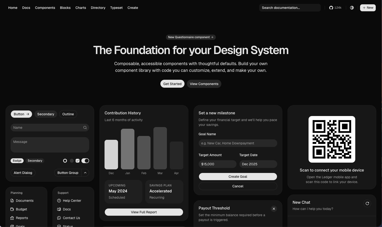
shadcn/ui is a revolutionary CLI tool that practically started a new era in the frontend ecosystem, tearing down the concept of a "package library" and replacing it with a philosophy of "code ownership". Built on Radix UI primitives, the components are written directly into your project's source code. Working with Tailwind v4 and modern CSS variables, shadcn/ui can now generate components automatically by talking to Cursor, Claude Code and autonomous AI agents, thanks to its recently introduced official MCP (Model Context Protocol) server support.
- Distribution Model: CLI registry tool (
npx shadcn@latest add) - Tailwind v4 Compatibility: Excellent integration with CSS variables and the
@themedirective - Standout Feature: Flawless Radix UI-based accessibility and an MCP server that integrates directly with AI agents.
- Official Site: shadcn/ui Official Website
3. HeroUI (Formerly NextUI)
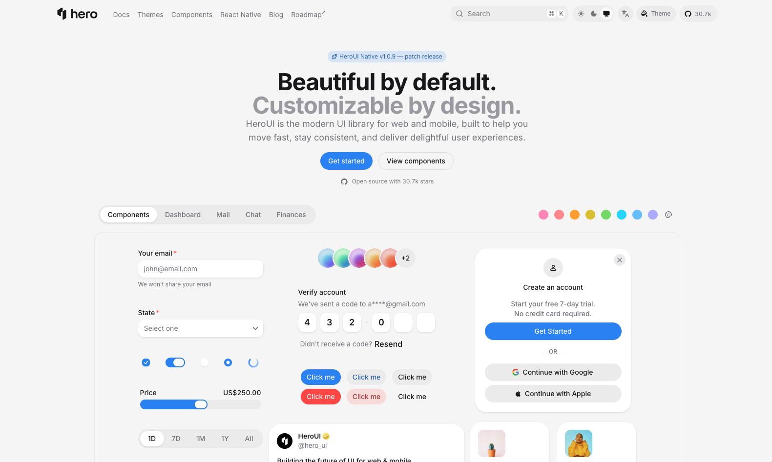
HeroUI is the rebranded and, with v3, thoroughly modernized version of the NextUI project that developers know well. Blended with Adobe's React Aria foundation, considered an industry standard, the library stands out for its Tailwind v4 support, strict TypeScript type safety and very elegant animations. Its structure, installed as a package dependency and easily themed, multiplies development speed in enterprise React projects.
- Distribution Model: NPM dependency package (
@heroui/react) - Tailwind v4 Compatibility: Native Tailwind v4 integration with v3
- Standout Feature: Flawless keyboard navigation and screen reader compatibility out of the box thanks to the React Aria foundation.
- Official Site: HeroUI Official Website
4. ReUI
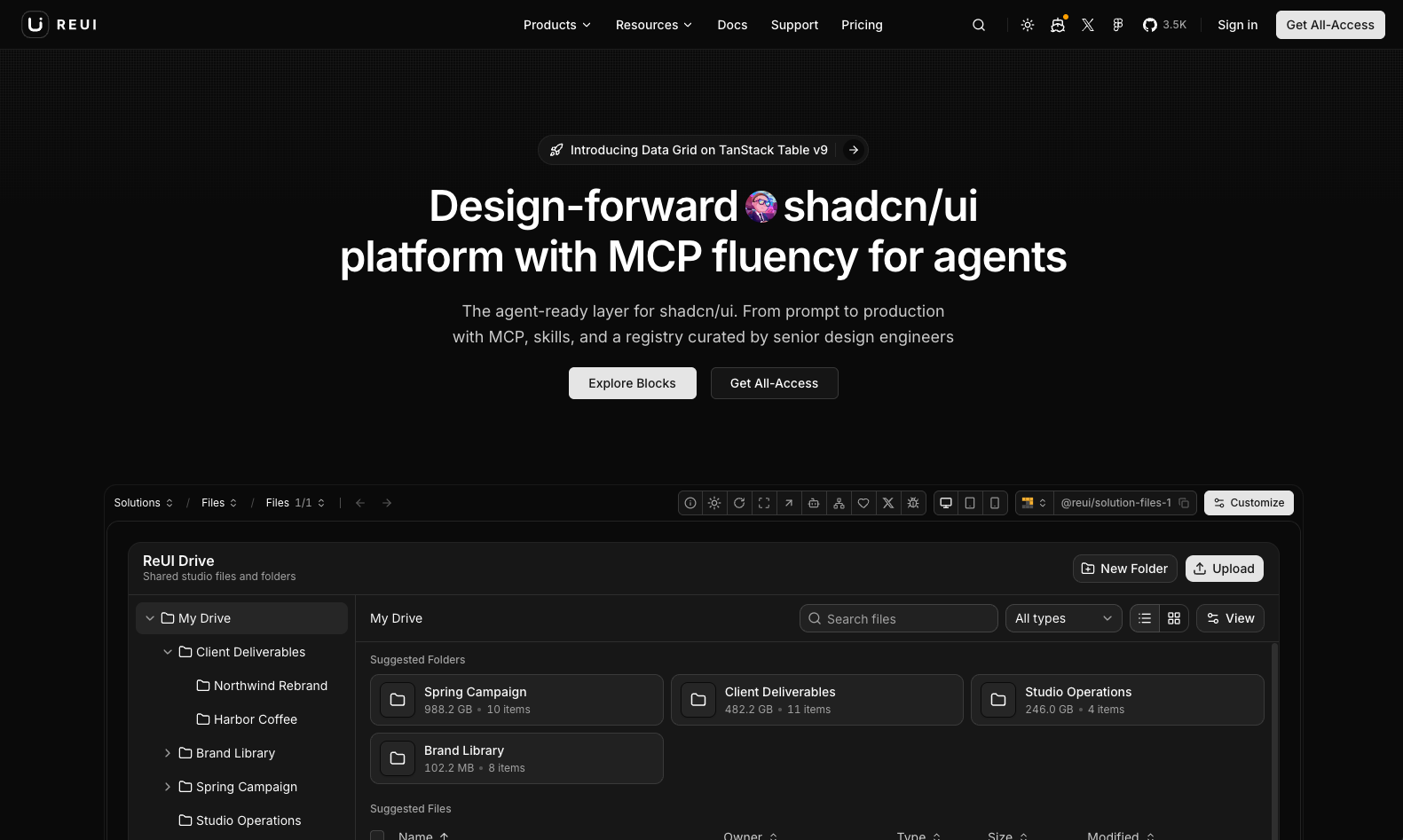
ReUI takes the popular shadcn/ui architecture a step further, offering components tailored for complex enterprise dashboards, dense data entry forms and analytics screens. Its foundation, fed by Base UI primitives, focuses especially on clean code patterns that AI agents can read, understand and flexibly manipulate.
- Distribution Model: shadcn-compatible CLI and registry mechanism
- Tailwind v4 Compatibility: Fully compatible style variables
- Standout Feature: Advanced data entry and table patterns for enterprise SaaS interfaces.
- Official Site: ReUI Official Website
5. Headless UI
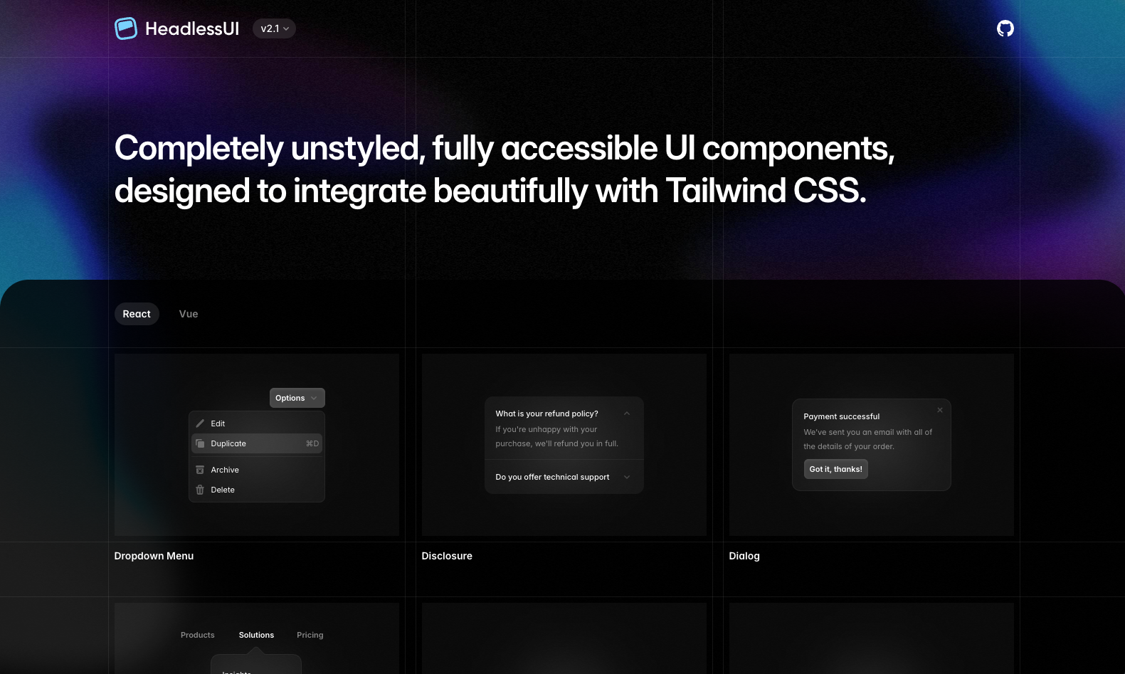
Headless UI is an unstyled component package built directly by Tailwind CSS's core development team (Tailwind Labs). With separate packages for React and Vue, the library fully solves the accessibility logic of components that require state management, such as dropdown menus, modals, radio groups, tabs and autocomplete search boxes (combobox). It is the most reliable foundation for professional teams who want to shape the visual interface according to their own design system.
- Distribution Model: NPM package (
@headlessui/reactor@headlessui/vue) - Tailwind v4 Compatibility: Flawless compatibility with all Tailwind versions since it contains zero styles
- Standout Feature: An accessibility foundation 100% faithful to WAI-ARIA guidelines, backed by Tailwind Labs.
- Official Site: Headless UI Official Website
6. Magic UI
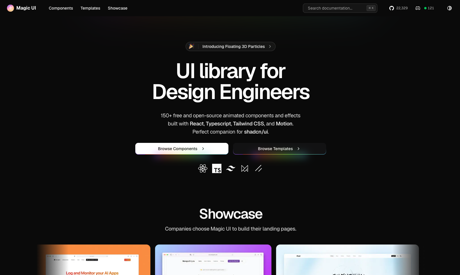
Magic UI is an animated component library built to instantly capture visitors' attention on marketing pages, product launches and modern SaaS landing pages. Skillfully combining Motion and Tailwind CSS classes, the library offers shimmer buttons, scrolling brand logos (marquees), interactive globes and rippling text effects. It can be added to your project with a single shadcn CLI command.
- Distribution Model: shadcn CLI and copyable source code
- Tailwind v4 Compatibility: Tailwind v4 and Motion foundation
- Standout Feature: Eye-catching micro-animations and modern landing page effects that boost conversion rates.
- Official Site: Magic UI Official Website
7. Aceternity UI
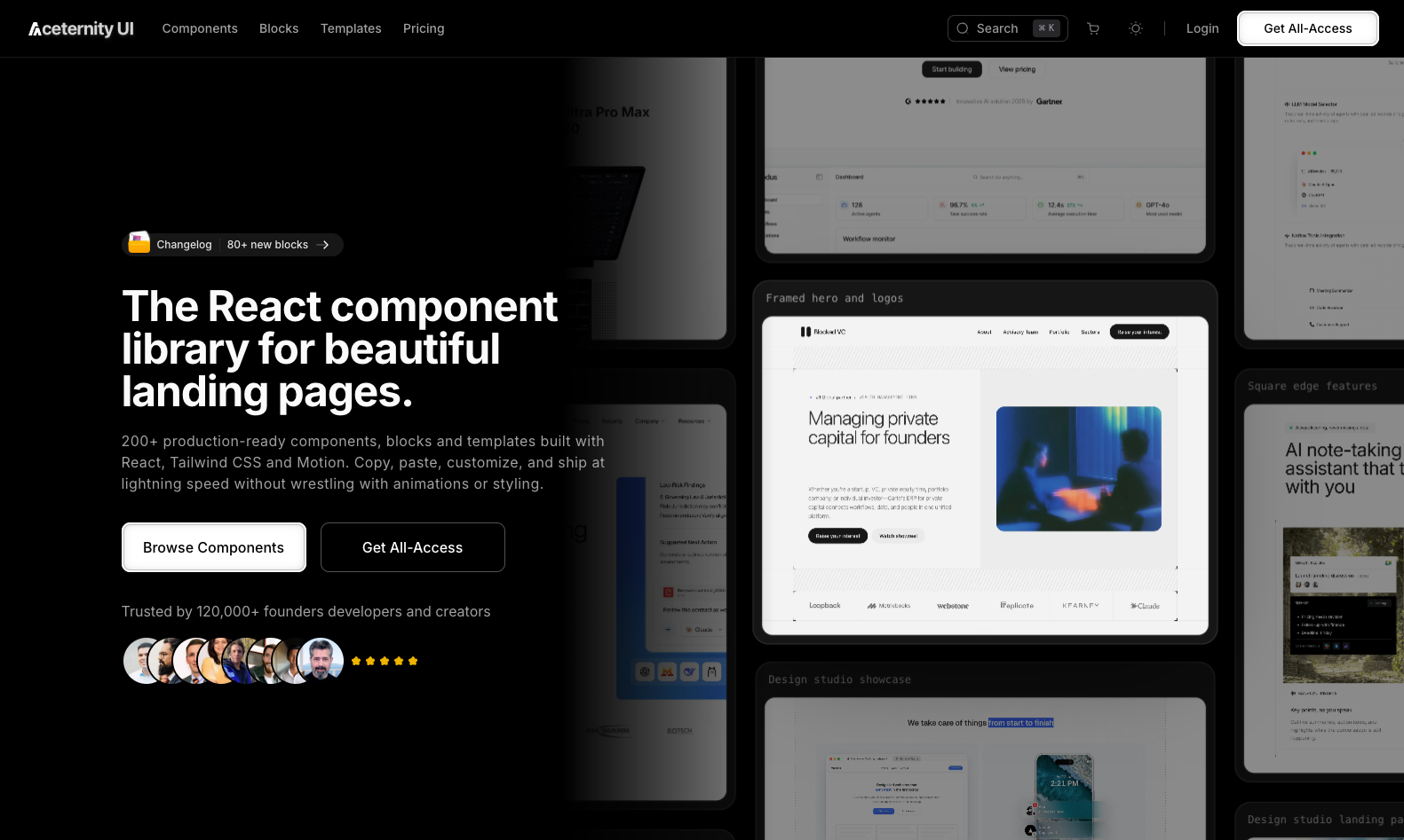
Aceternity UI is indispensable for developers who want to move their websites beyond standard interface patterns and turn them into a visual experience. Offering 3D perspective cards, dynamic spotlights that follow mouse movement, Aurora backgrounds and scroll-triggered visual transitions, the library is unique, especially for portfolios and innovative tech startups.
- Distribution Model: CLI and copyable React/Tailwind components
- Tailwind v4 Compatibility: Modern Tailwind utility classes and CSS keyframe animations
- Standout Feature: 3D cards, canvas effects and dynamic lighting that deliver top-tier visual quality.
- Official Site: Aceternity UI Official Website
8. Cult UI
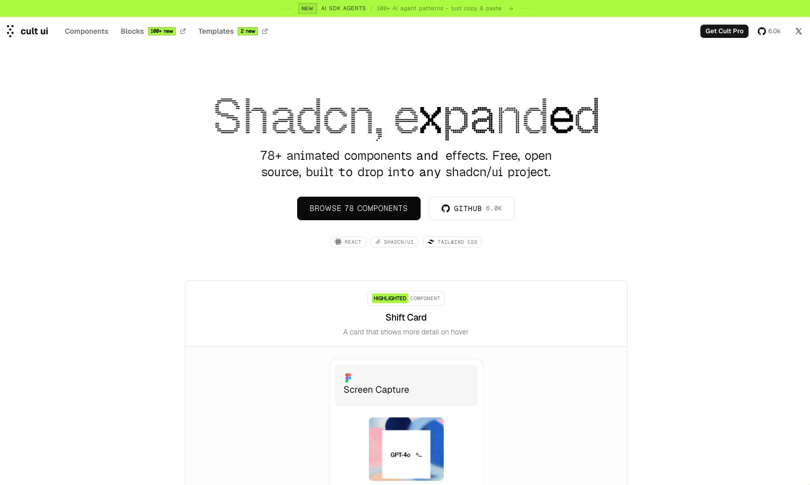
Cult UI is a collection of custom interactive components developed to add dynamism to the shadcn/ui ecosystem. It enriches the user experience with innovative button transitions that bring ordinary interface elements to life, dynamic tabs, glowing borders and original card structures.
- Distribution Model: Source code copying and registry integration
- Tailwind v4 Compatibility: Full compatibility with CSS variables and utility classes
- Standout Feature: Micro-animations and transition effects that add aesthetic depth to standard interfaces.
- Official Site: Cult UI Official Website
9. HyperUI
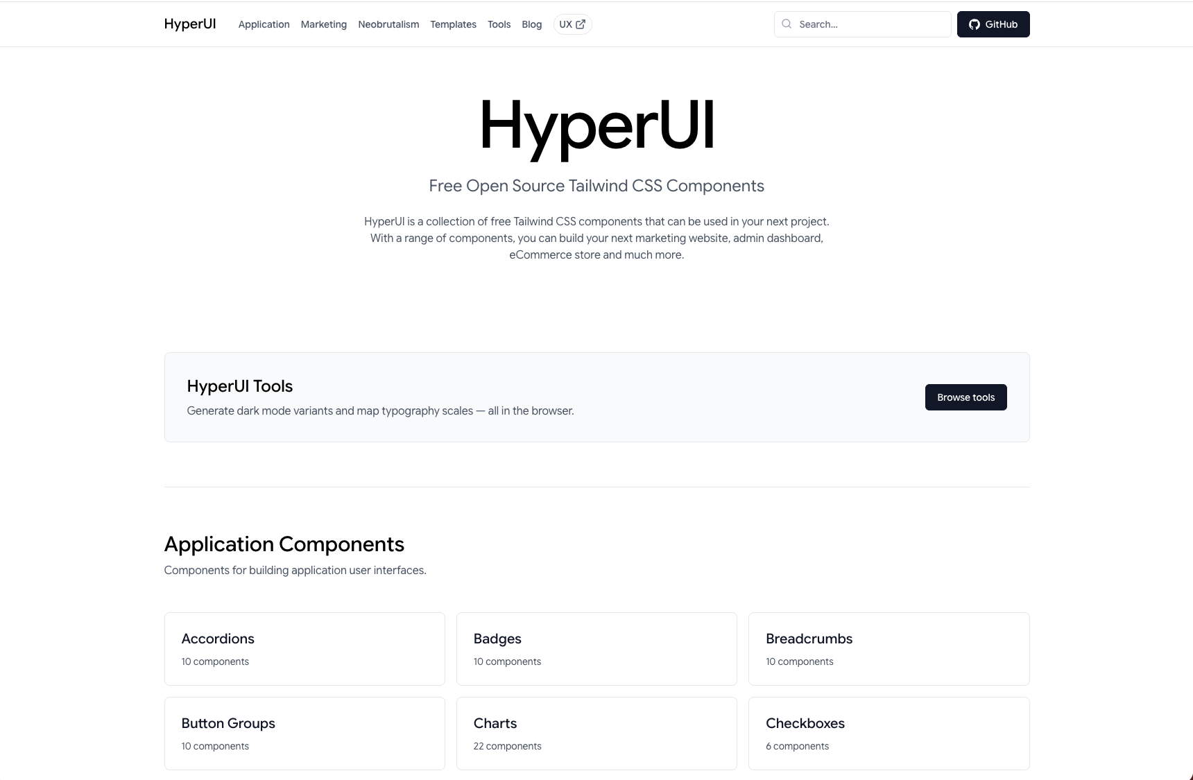
HyperUI offers clean HTML and Tailwind CSS templates you can copy and paste directly, with no JavaScript dependencies or complex build steps. It has a rich collection split into dozens of categories, from e-commerce product cards to pricing tables and from navigation bars to user login forms. It is extremely practical for static websites and rapid prototyping.
- Distribution Model: Direct copy-paste HTML/Tailwind markup
- Tailwind v4 Compatibility: The latest Tailwind v4 utility classes
- Standout Feature: Zero JavaScript dependencies, instantly copyable semantic markup.
- Official Site: HyperUI Official Website
10. Kibo UI
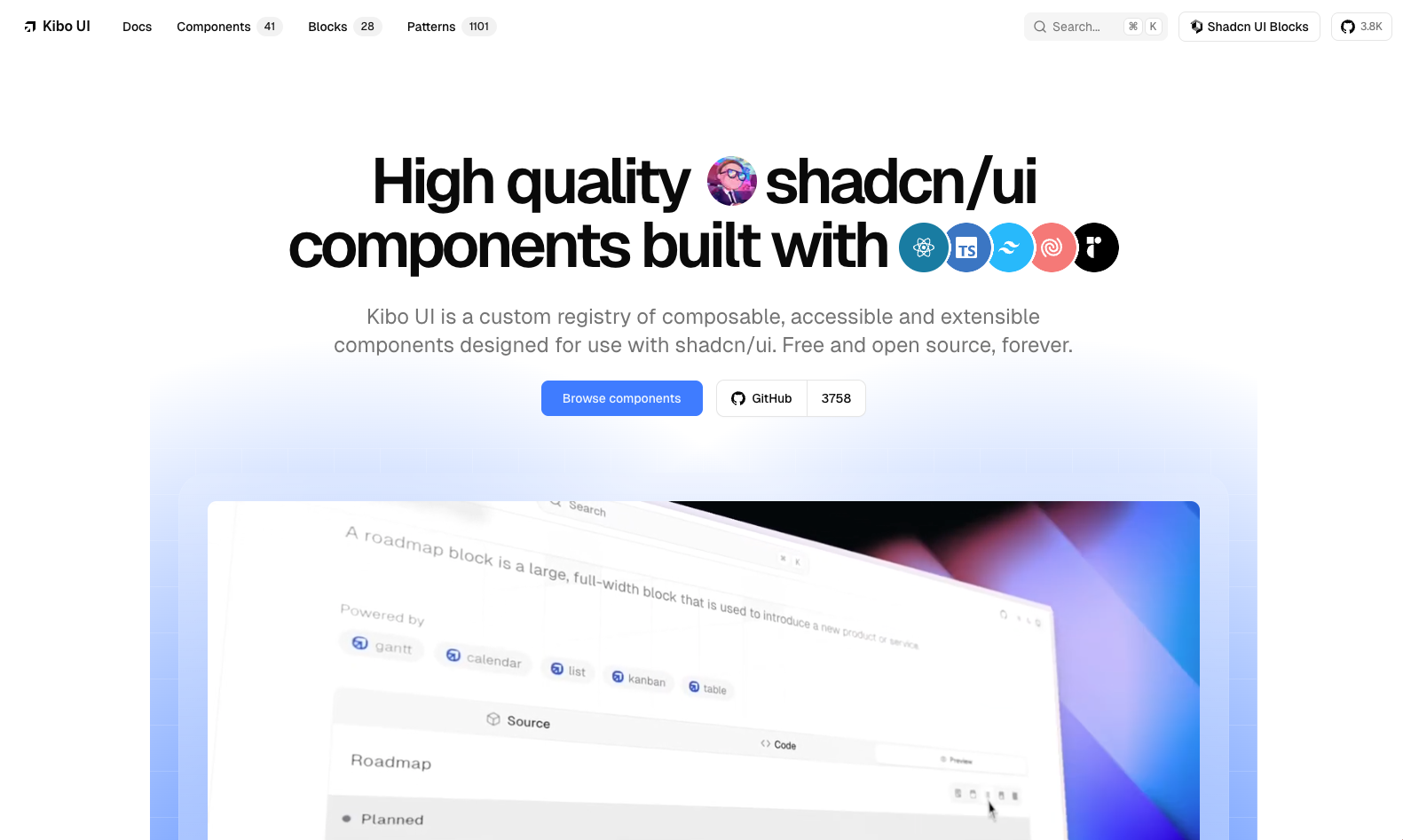
Kibo UI goes beyond basic buttons and form controls to solve the complex interface patterns enterprise applications struggle with most. It offers drag-and-drop Kanban boards, Gantt charts used in project management, multi-functional event calendars and advanced file upload interfaces. Its structure, installable with the shadcn CLI, fits seamlessly into existing projects.
- Distribution Model: shadcn CLI registry system
- Tailwind v4 Compatibility: CSS variables and modern Tailwind classes
- Standout Feature: Advanced enterprise widgets such as Kanban, Gantt, calendar and file uploader.
- Official Site: Kibo UI Official Website
11. daisyUI
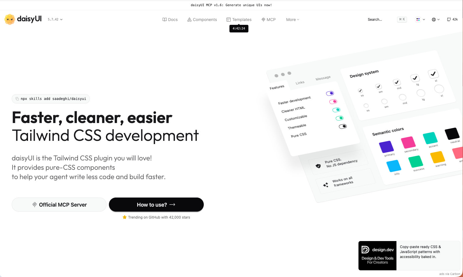
daisyUI is a perfect alternative for developers who complain about the clutter Tailwind classes create inside HTML templates. Running as a Tailwind v4 plugin (@plugin "daisyui";) since daisyUI v5, the library offers semantic classes like btn, card, badge and modal. Thanks to its built-in theme engine, you can apply more than 30 ready-made color palettes in seconds with a single data-theme HTML attribute.
- Distribution Model: Tailwind CSS plugin (NPM package)
- Tailwind v4 Compatibility: Full native CSS plugin support with v5
- Standout Feature: Pure CSS architecture, framework independence and an effortless theme switching system.
- Official Site: daisyUI Official Website
12. FlyonUI
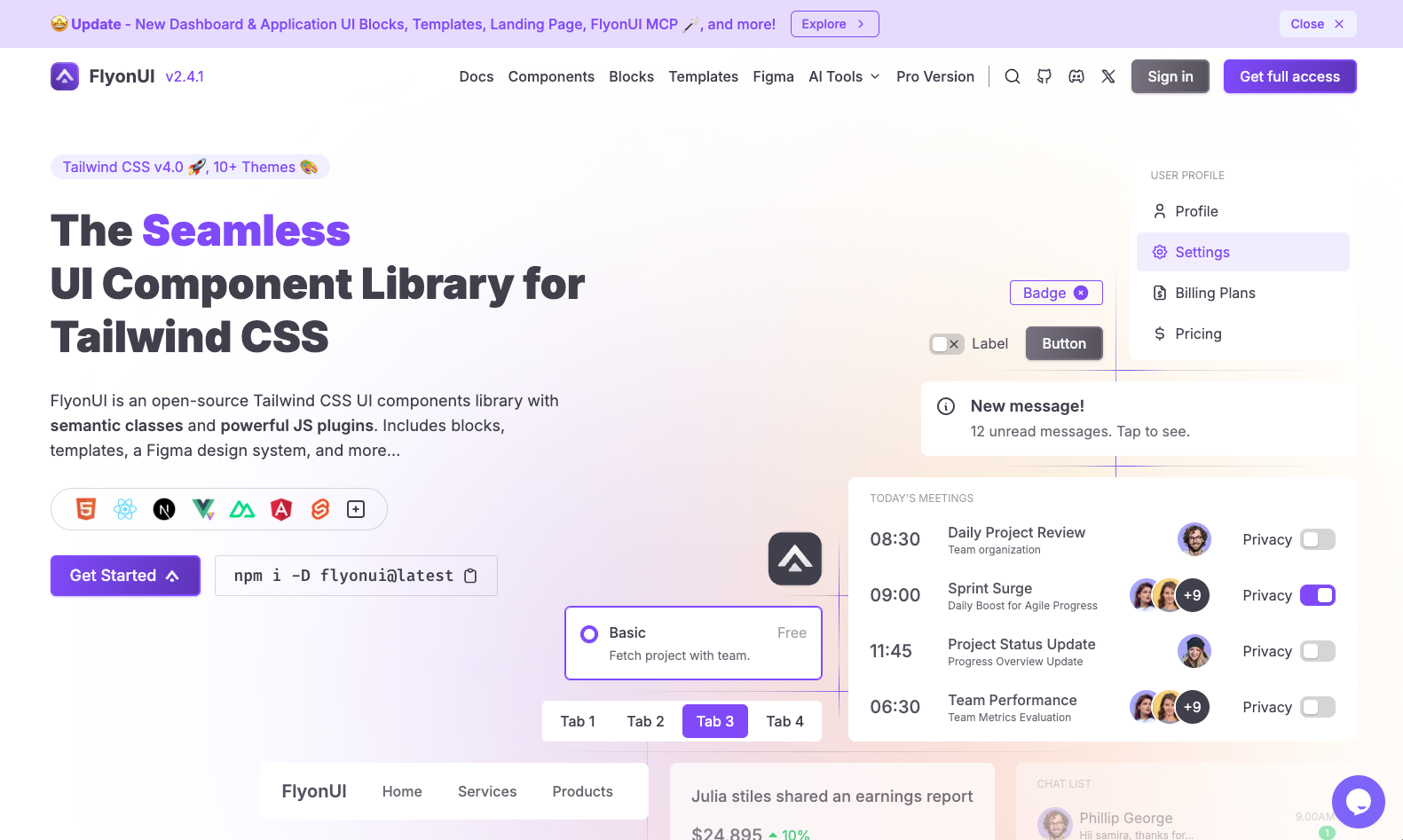
FlyonUI is a powerful library that blends daisyUI's semantic CSS class approach with modern JavaScript interaction plugins. Installed as a Tailwind v4 plugin, FlyonUI ships the JavaScript behavior of interactive components such as dropdowns, accordions and notification windows ready to use, sparing developers from writing extra state management code.
- Distribution Model: NPM package and Tailwind plugin
- Tailwind v4 Compatibility: Fully compatible with the Tailwind v4 plugin architecture
- Standout Feature: A flawless balance of semantic CSS classes and ready-made interactive JavaScript logic.
- Official Site: FlyonUI Official Website
13. Flowbite
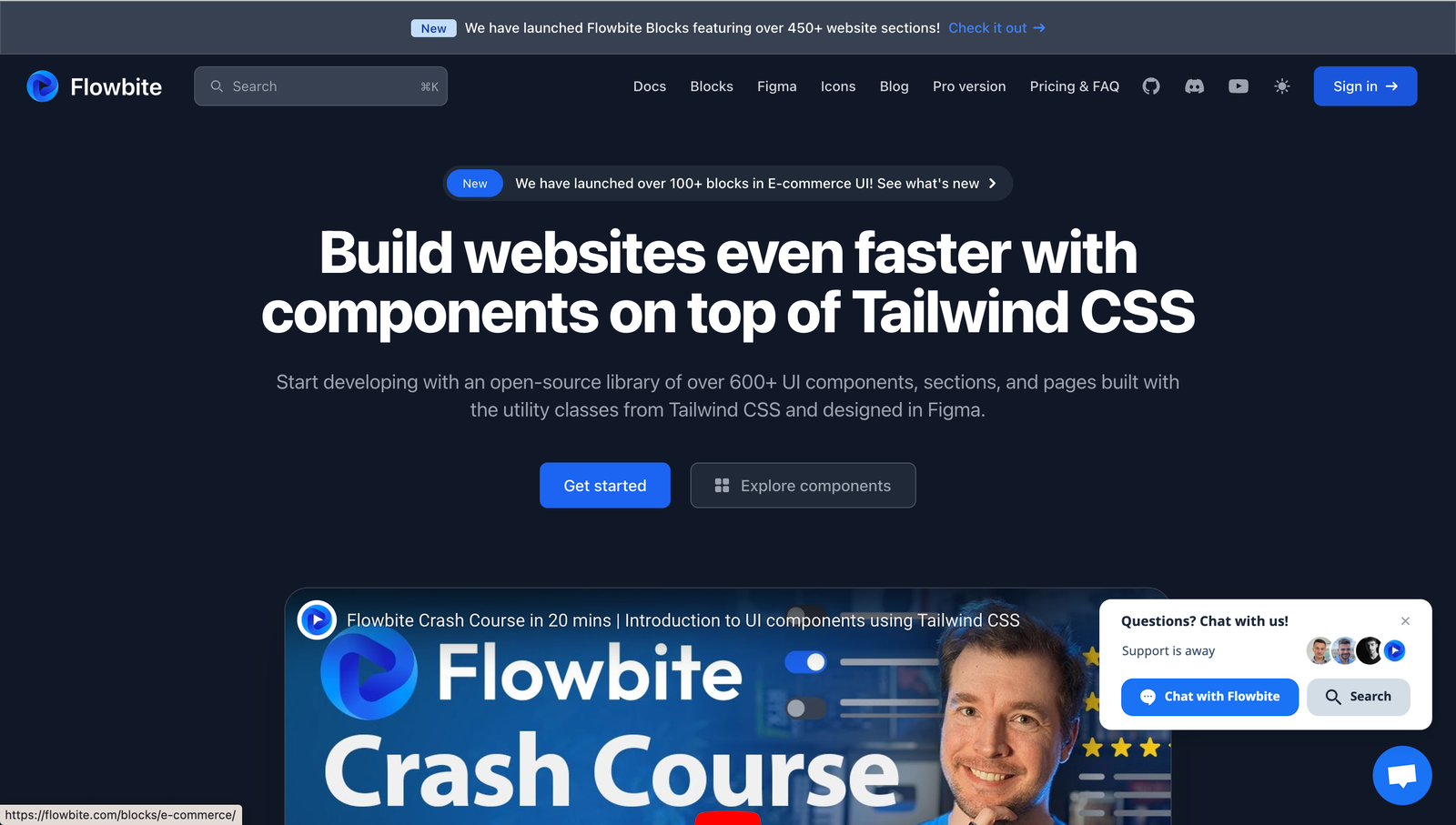
Flowbite is one of the oldest libraries in the Tailwind ecosystem and one of the giants with the most extensive documentation. Alongside an interactive JavaScript core that works through HTML data attributes (data-*), it offers dedicated official packages for React, Vue, Svelte and Angular. Covering almost every interface element, from date pickers to advanced navigation bars, Flowbite is a reliable choice for enterprise web platforms.
- Distribution Model: NPM packages and direct HTML markup
- Tailwind v4 Compatibility: Modular structure and framework adapters
- Standout Feature: Native package support for React, Vue, Svelte and Angular and a rich Figma design ecosystem.
- Official Site: Flowbite Official Website
Comparison Table of the 13 Libraries
The table below lets you quickly compare distribution model, framework requirements and use-case focus when choosing the best library for your projects:
| Library | Framework Support | Distribution Method | Core Approach | Best Use Case |
|---|---|---|---|---|
| Preline UI | HTML / React / Vue / Laravel | NPM + Copying | Rich blocks and JS plugins | Marketing sites and admin dashboards |
| shadcn/ui | React (Next.js / Vite) | CLI Registry Tool | Source code ownership + Radix UI | Fully customizable enterprise web apps |
| HeroUI | React | NPM Dependency | React Aria + type-safe theming | Fast, accessible and modern React projects |
| ReUI | React | CLI / Registry | Base UI + shadcn compatibility | Complex data- and form-focused SaaS screens |
| Headless UI | React / Vue | NPM Dependency | Fully unstyled accessible primitives | Large-scale projects with a custom design system |
| Magic UI | React | shadcn CLI | Motion-based modern animations | Eye-catching marketing and landing pages |
| Aceternity UI | React | CLI + Copying | 3D effects and dynamic animations | Creative portfolios and visionary product pages |
| Cult UI | React | Registry / Copying | shadcn micro-interactions | Original button and card animations |
| HyperUI | Framework-Agnostic | Copy-Paste | Pure HTML and Tailwind markup | Static websites and rapid prototypes |
| Kibo UI | React | shadcn CLI | Enterprise-grade complex widgets | Dashboards that need Kanban, Gantt charts and calendars |
| daisyUI | Framework-Agnostic | Tailwind Plugin | Semantic CSS classes (btn, card) | Projects that want clean HTML and zero JS runtime |
| FlyonUI | HTML / JS / Frameworks | Tailwind Plugin | Semantic CSS + ready-made JS logic | Quickly built interactive general interfaces |
| Flowbite | HTML / React / Vue / Svelte | NPM + Data Attributes | Multi-framework support and ready-made UI | Enterprise web apps and versatile platforms |
The Open Source Ecosystem After Tailwind Plus
Shopify's acquisition of Tailwind Labs and the closing of the Tailwind Plus service to new subscriptions created a major turning point in the frontend world. Teams that used to turn to the official Tailwind UI templates are now moving to open source alternatives developed by the community, which come with highly innovative features.
In particular, the CLI registry mechanism offered by the shadcn/ui ecosystem has become a standard among open source UI libraries. Instead of competing with each other, libraries can now work as modular pieces that complement one another on the same standard, as in the examples of ReUI, Magic UI and Kibo UI. With the addition of AI standards like the Model Context Protocol (MCP), modern Tailwind component libraries have become an indispensable productivity engine for both human developers and autonomous coding agents.
A Guide to Choosing the Right Library for Your Project
To make the right choice for the type of project you're building and your goals, you can follow this roadmap:
- Source Code Control and AI Support: If you want to master every line of code, minimize external dependency risk and work smoothly with AI assistants, shadcn/ui should without question be your foundation. For advanced enterprise dashboards, you can enrich this foundation with ReUI or Kibo UI.
- Fast and Effortless React Applications: If you want to install components directly via npm and go straight to production without worrying about accessibility (ARIA) standards, HeroUI offers the most balanced experience.
- Conversion-Focused Landing Pages: If you're looking for visual effects that will captivate visitors while you showcase your product, Aceternity UI and Magic UI are your most powerful arsenal.
- Non-React Environments and Lightweight Architecture: If you work with Vue, Laravel, Svelte or plain HTML and want to avoid the clutter created by dozens of Tailwind utility classes in your code, you can achieve excellent developer ergonomics with daisyUI or HyperUI.